
Heart Coffee Co. Rebrand
Deliverables
Logo & Brand Guidelines
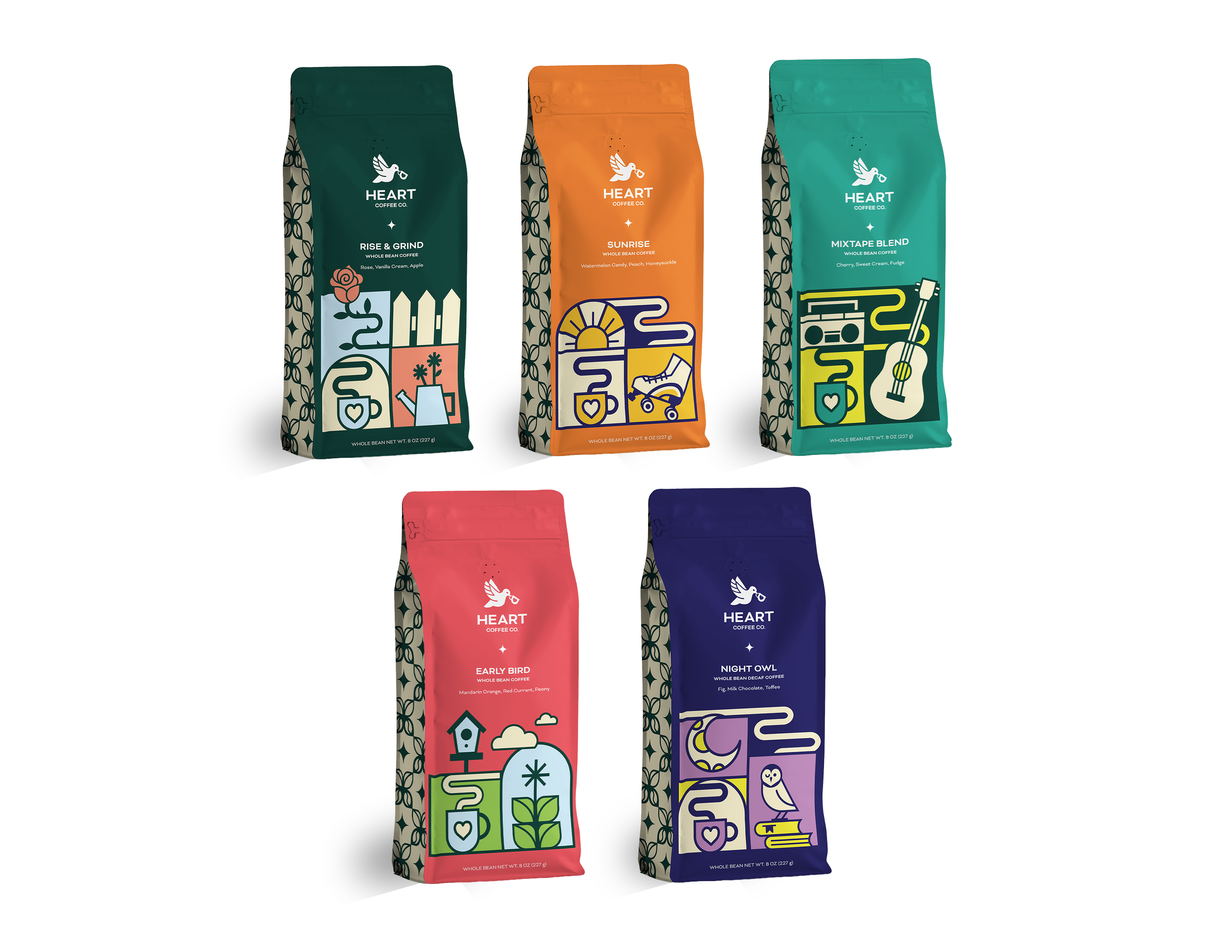
5 Coffee Packages
1 To-Go Cup
3 Advertisements
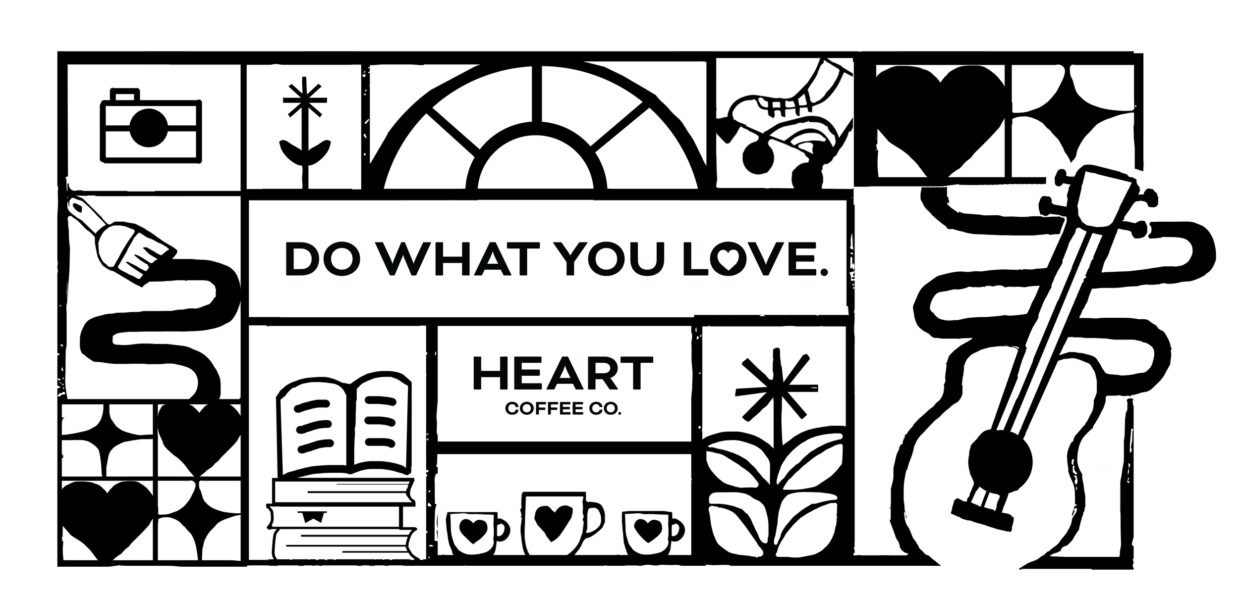
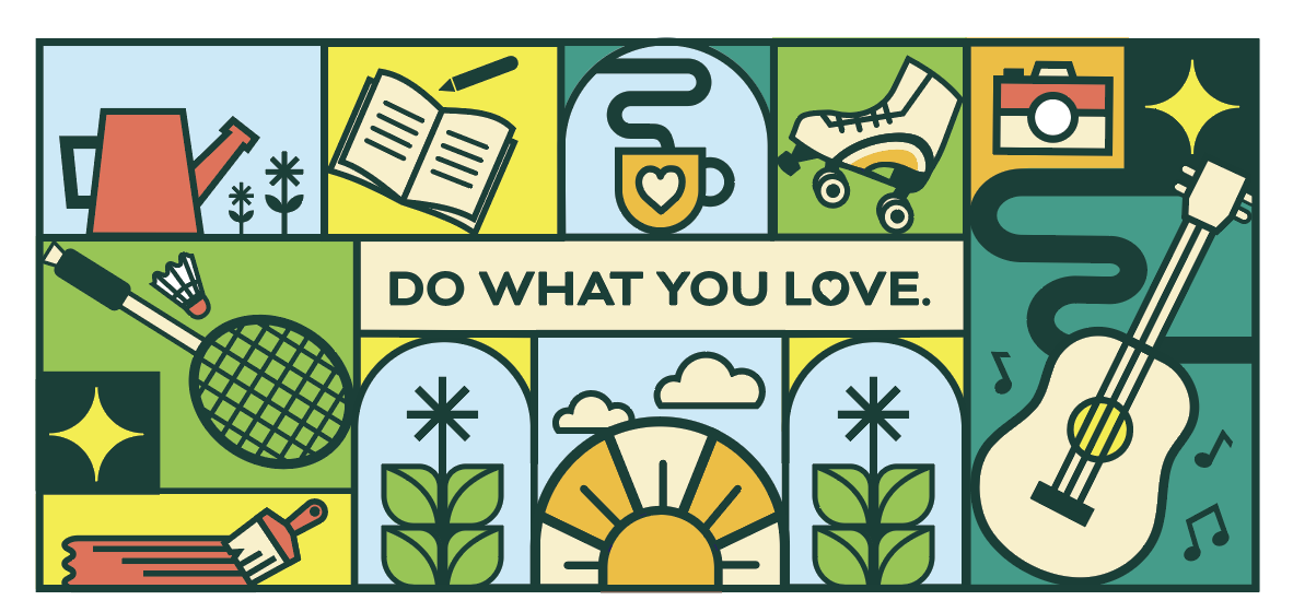
Wall Mural
Microsite
Description
My senior capstone is a rebranding project of Heart Coffee Company. This is a high-end brand of coffee based in Portland, Oregon, that is made to give you the energy to do what you love, whether it be your favorite hobbies, pastimes, or just enjoying the day and being present.
Proposal
Heart Coffee Roasters has 2 retail cafes and a roasting facility in Portland, Oregon. The cafes create a hospitable and unplugged environment that is open and welcoming to all people. The essence of the brand stems from the idea that a great cup should highlight the distinct fruit flavors that are found in coffee. Heart focuses on building strong relationships with producers in Kenya, Ethiopia, Colombia, Honduras, Mexico, Brazil & Guatemala, whose farms are visited throughout the year. The brand’s graphic design, however, lacks a clear personality and fails to reflect the warm and welcoming environment of the café.
The rebrand of Heart Coffee Roasters to Heart Coffee Co. communicates the brand’s welcoming personality and highlights the uniqueness of its coffee products. Instead of feeling cold and distant, the brand is approachable and feels closer to its audience’s values. I have created a brand with unique, cohesive elements across all its products. In my design, I created a warm, friendly, yet sophisticated brand of coffee. I seek to appeal to coffee enjoyers who consume specialty coffee and other casual coffee enjoyers.
Company Profile
Heart Coffee Company is a high-end brand of coffee that strives to give its audience the energy to do what they love. In the age of distraction, Heart wants to encourage its audience to revive their passions and enjoy the moment.
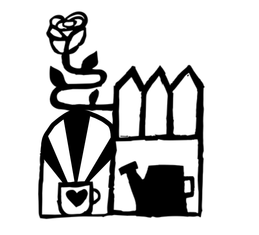
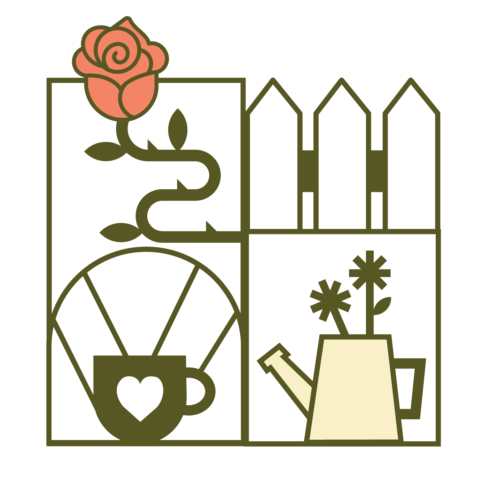
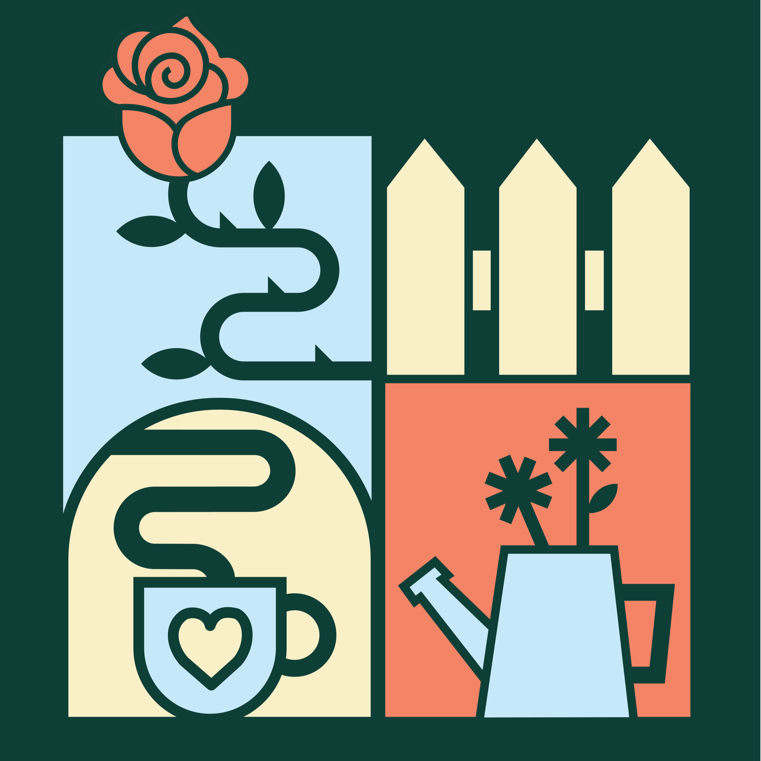
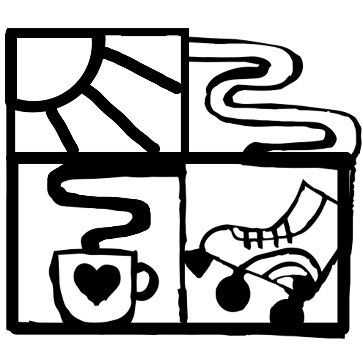
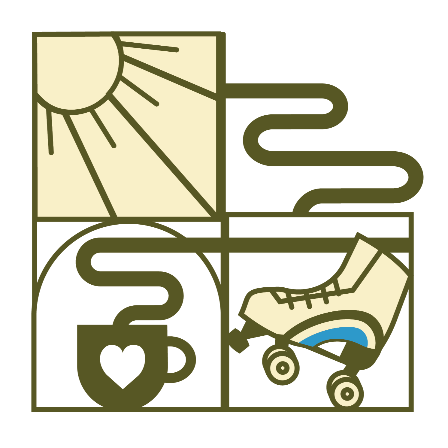
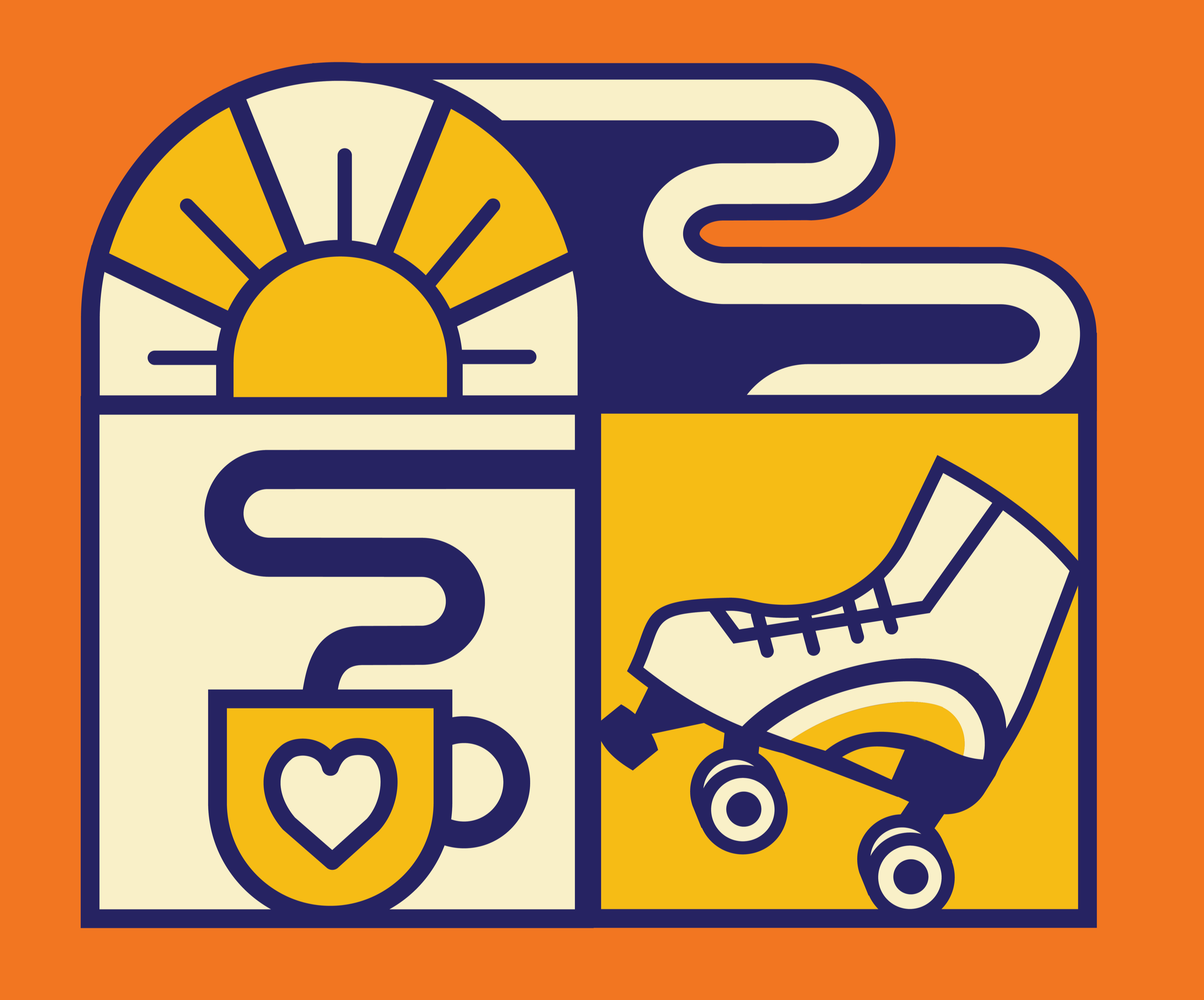
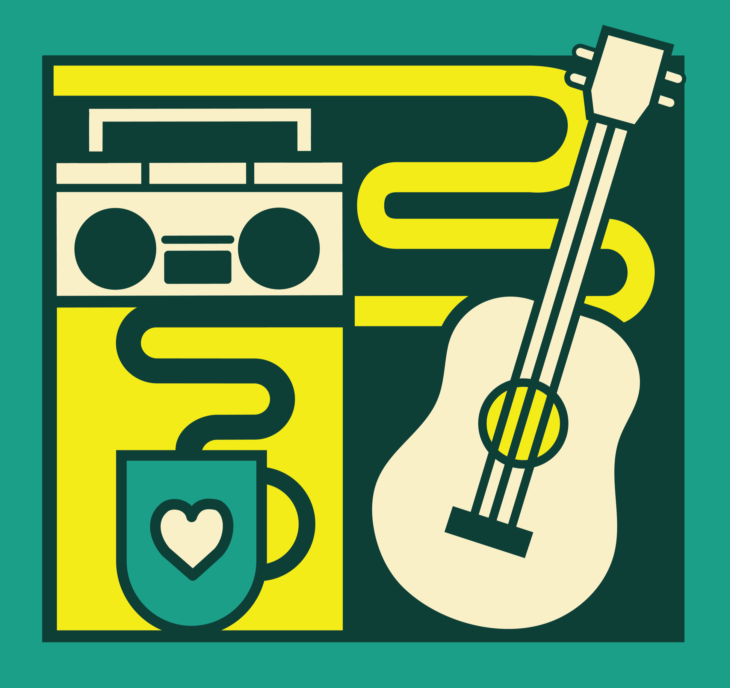
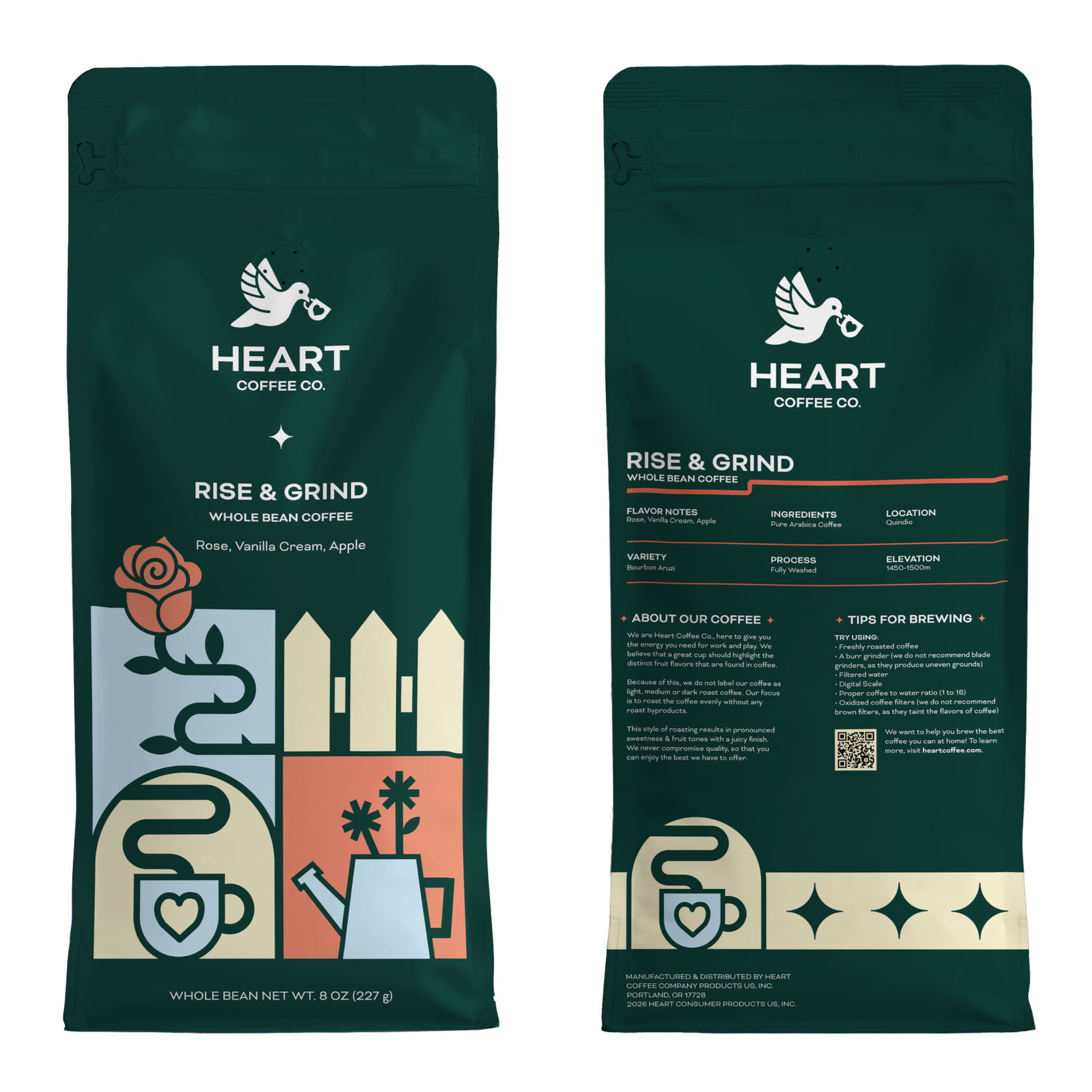
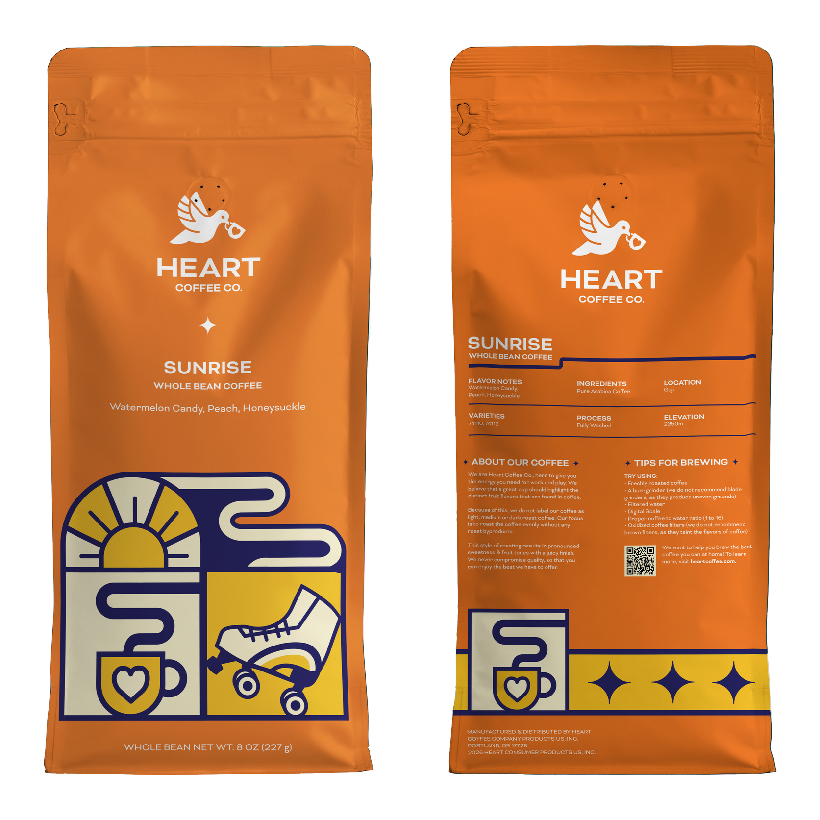
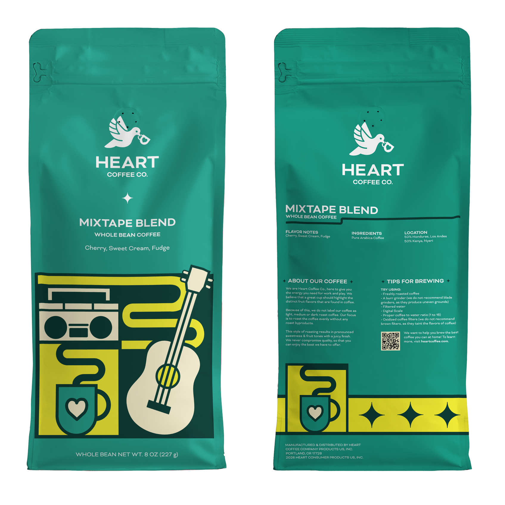
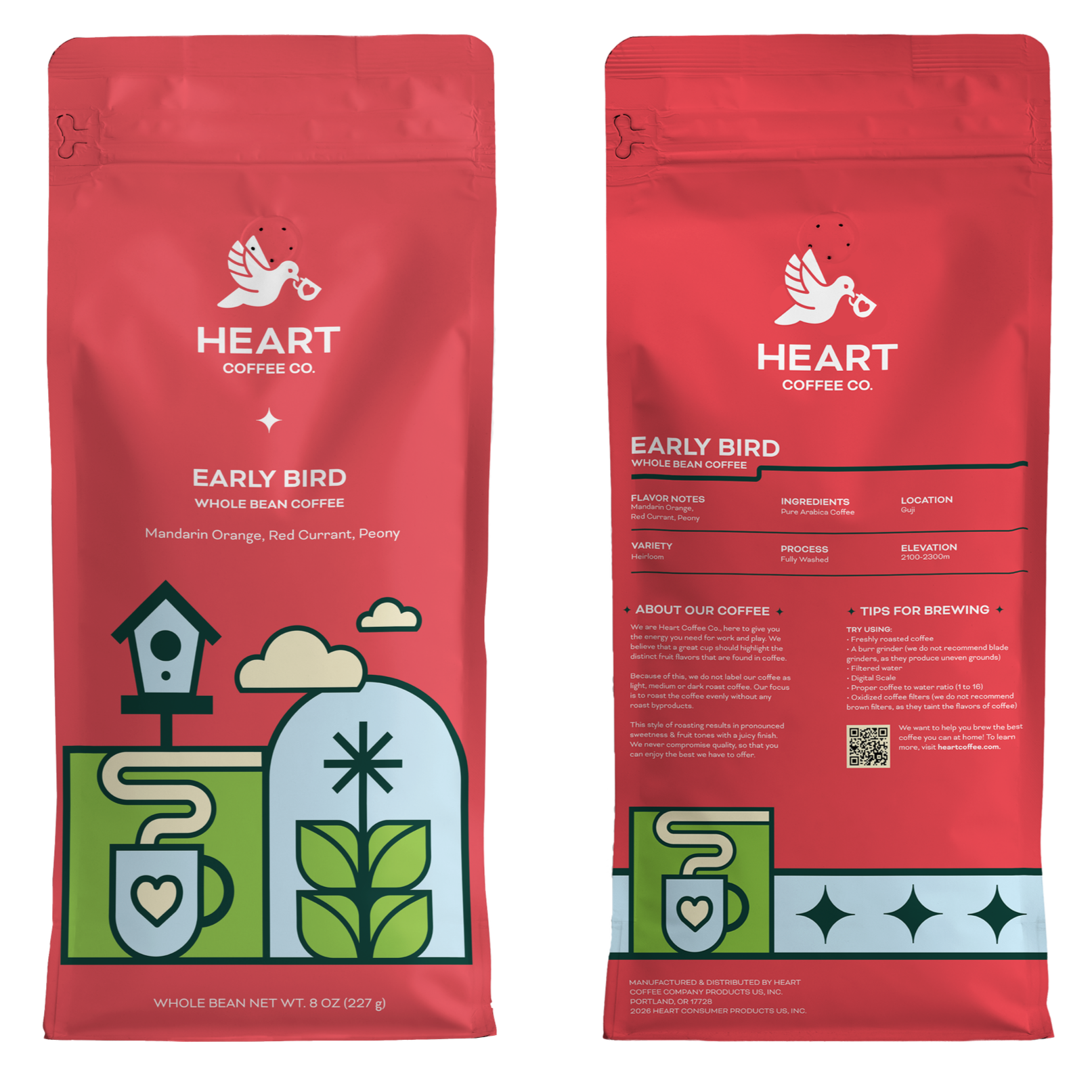
Each of the five coffee packaging designs represents a different activity or the act of peacefully existing in the present moment. Stylistically geometric, friendly, and fun, the illustrations pictured on each bag are warm, inviting, and dynamic. A wall mural was also designed to be used in a cafe, reinforcing the brand’s mission and its playful personality. The design of the to-go cup, also made to be used in a cafe, communicates the brand’s elegance and staple design elements.
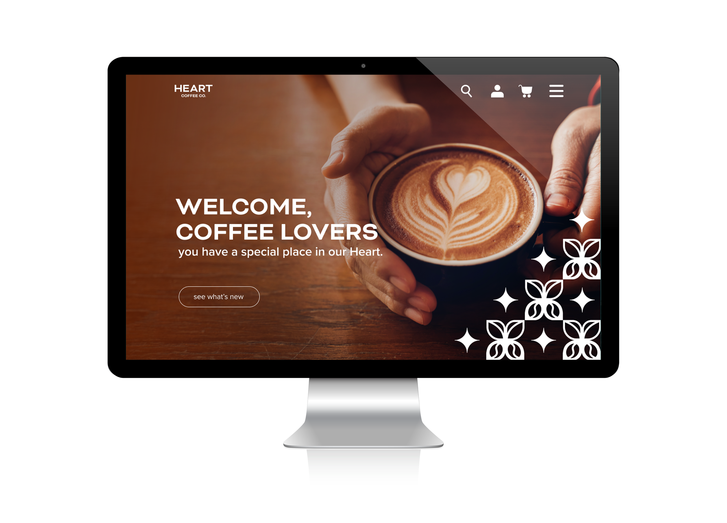
While gentle, kind, and inviting, Heart’s coffee is of exceptional quality. This is reflected in the design of the microsite, which consumers can use to access information about the company and purchase coffee products.
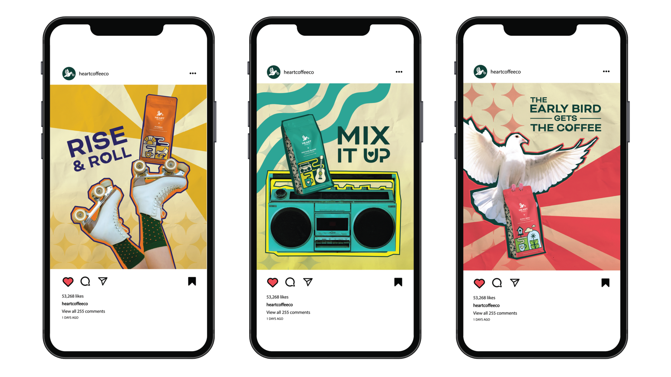
Three Instagram advertisements were designed to each advertise a different coffee product while showcasing the expressiveness of the brand.
To accompany the logo, a brand guideline was created to communicate the brand’s values and mission, and the proper use of the logo and brand elements.
What makes this brand special is the duality between its elegance and vibrant personality, and how that is balanced meticulously throughout the design process.
Objectives
To independently research, design, and produce a logo, website homepage, 5 coffee packaging designs, 1 to-go cup, 3 Instagram Advertisements, and 1 Wall Mural Illustration to rebrand the coffee brand Heart Coffee Roasters to Heart Coffee Co.
To research the brand and its competitors and apply information to create a recognizable brand that stands out as its own unique design against its competition.
To apply prior knowledge of design principles, typography, illustration, and branding to create compelling, organized, and visually interesting components.
To analyze and evaluate my own designs at different stages of the project to improve design components throughout the process.
To collect and apply critique and feedback from peers and faculty to advance design pieces throughout the process.
To create designs that show existing attributes and goals of the brand while making it compelling and eye-catching.
To present my work in a professional, efficient, and concise manner to communicate my brand attributes and design rationale effectively.
The target audience is coffee drinkers, who are typically young adults and adults. Therefore, people between the ages of 13 and 59. The audience includes consumers of specialty coffee, consumers of sustainably-made products, which are typically considered high-end products. 46% of American adults had specialty coffee in the past day, up 84% since 2011 and surpassing past-day traditional coffee consumption (42%), according to the National Coffee Association’s (NCA) Specialty Coffee Report.
Target Audience
Process Work
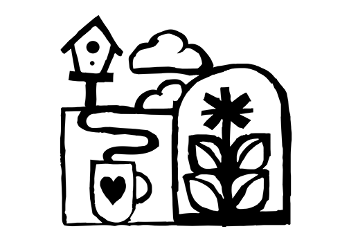


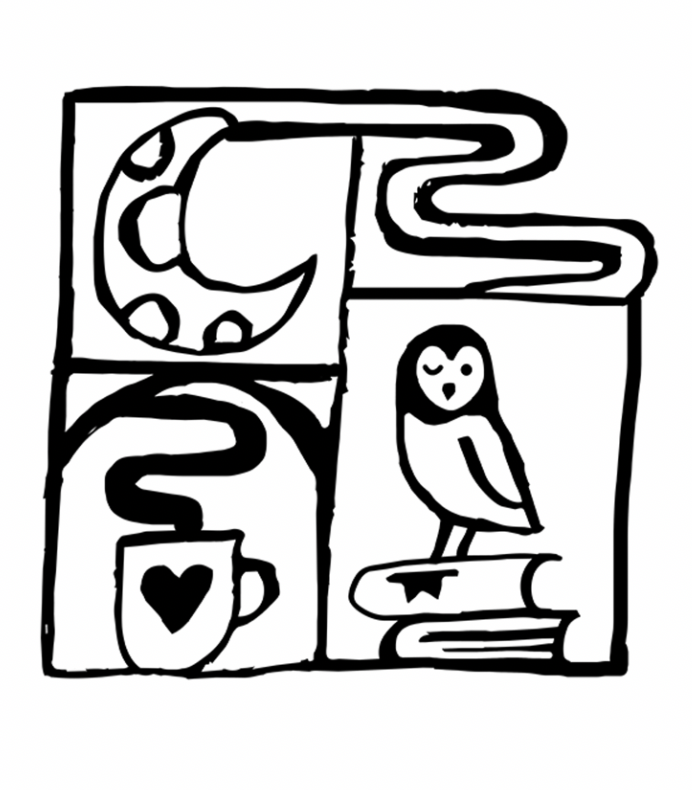
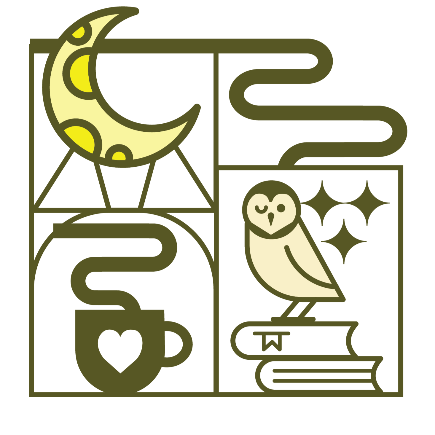
The processing of my illustrations began when I pinpointed the design style of my brand and the elements I wanted to incorporate in each one. Once I figured out I wanted to use a soft, geometric style, I began the process of sketching thumbnails to articulate the placement of elements, establish balance, and create repetition of shapes that would soon become defining features of the brand. It was of great importance to me to create a unique design for each bag of coffee, so they each represent something different while remaining unified under the brand’s aesthetic. I used my sketches to digitally illustrate on top of in Adobe Illustrator, using minimal color schemes for the sake of simplification.
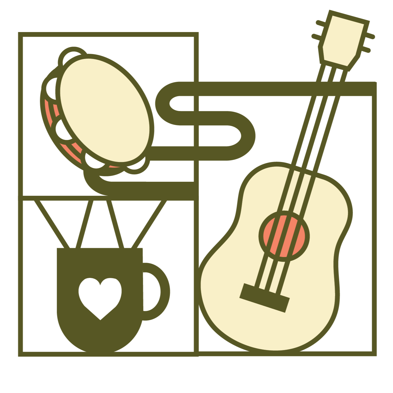
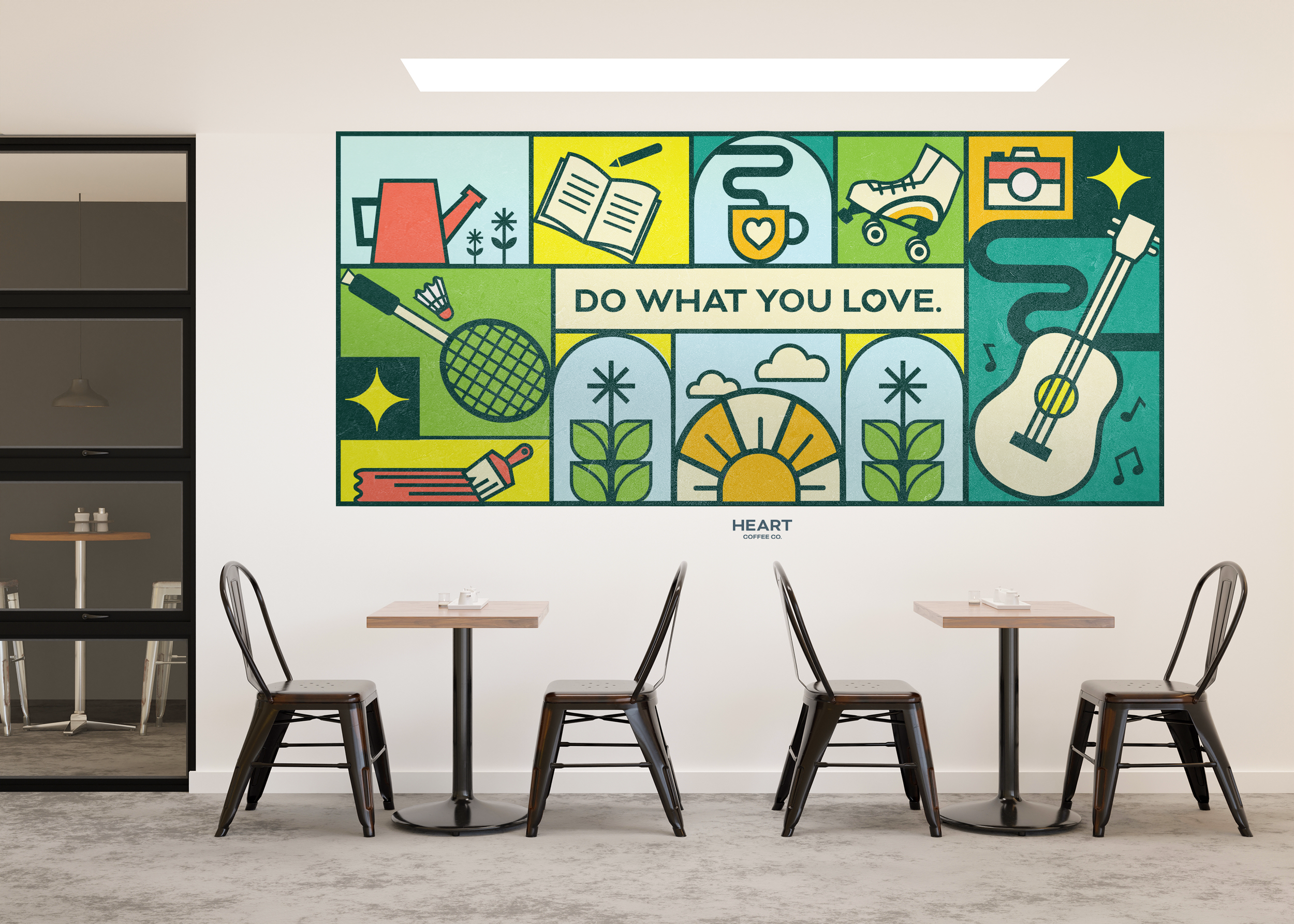
The wall mural is a design component much like the packaging. It uses the same illustration style and directly reflects the brand’s mission. Design elements were taken from the packaging illustrations and altered for the wall design. While processing it, I took the “highlight” illustrations from some of the bag designs and created new ones to represent activities. I used my sketch to draw and assemble the design in Adobe Illustrator.
The microsite was created in a similar way, as I built it from wireframes I created. I used the design elements I created to brand the website, such as the pattern used in the packaging and its illustrations. For the to-go cup, design elements and colors were also carried over from previous designs I had created, for the sake of cohesion and strong branding.
The Instagram ads take advantage of the platform by being really fun and expressive. I wanted to delve into a different style when creating the ads, so not every component of my project was the illustrations. I collected imagery to utilize in my collage-style ads, and referenced a part of the packaging that was being advertised.
Process Narrative
Research Synopsis
To research prior to project development, I surveyed many coffee websites and their packaging to get a feel for what information was commonly presented to consumers. I did the most research for the packaging and microsite. I viewed sustainable coffee websites and ones with very expressive design to see how their branding filtered through web formats.
My research also involved going to the grocery store to see how coffee packaging was differentiated among brands, how flavors and different roasts were showcased, and how design elements looked on packaging in terms of proximity and scale as I held them in my hand. I also used physical packaging to create my own after not only using it for measurements, but also taking it apart to see how I could assemble my own.
While deciding what style the brand was going to have, I used Dribbble as a resource. I spent much time scrolling on this website to absorb a variety of illustration styles used in package design before I created a moodboard. I also surveyed Packaging of the World to take notes on how color (or lack thereof) was used in bright and expressive food packaging.
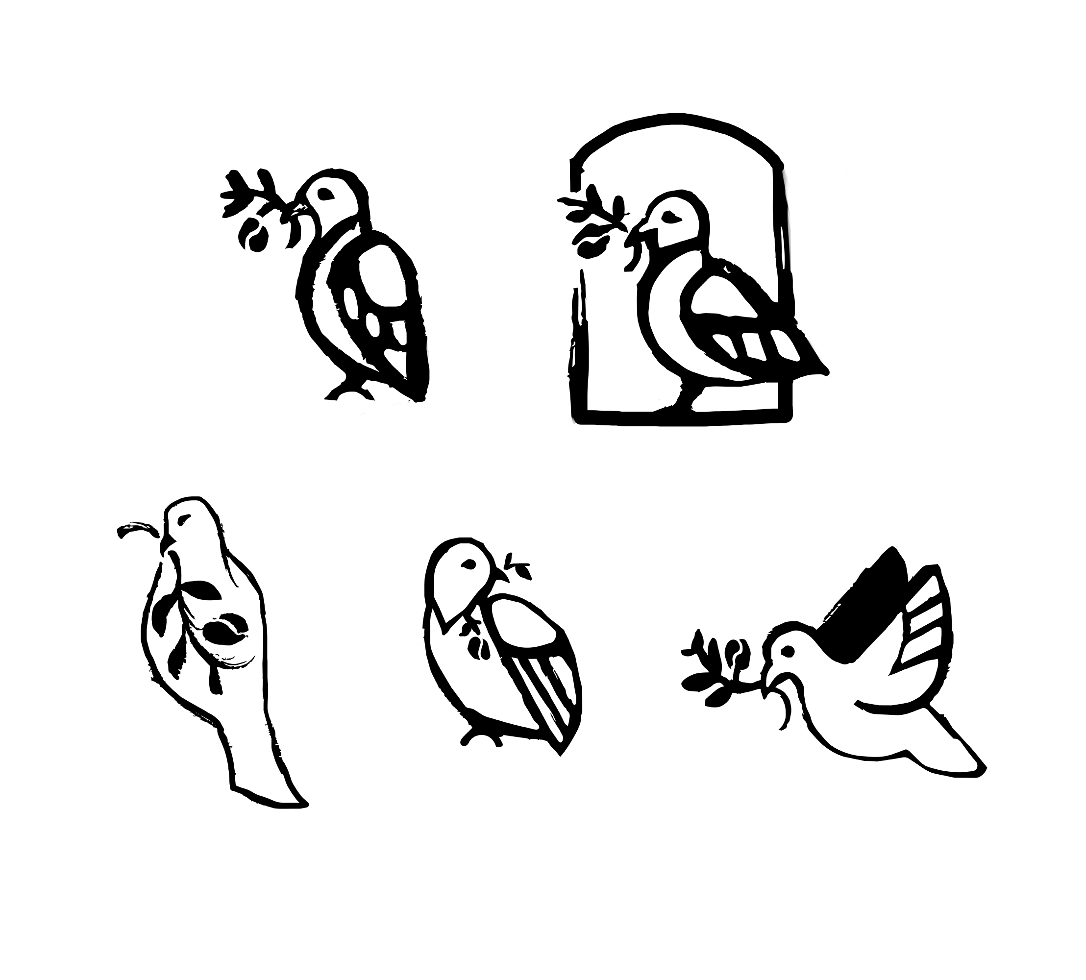
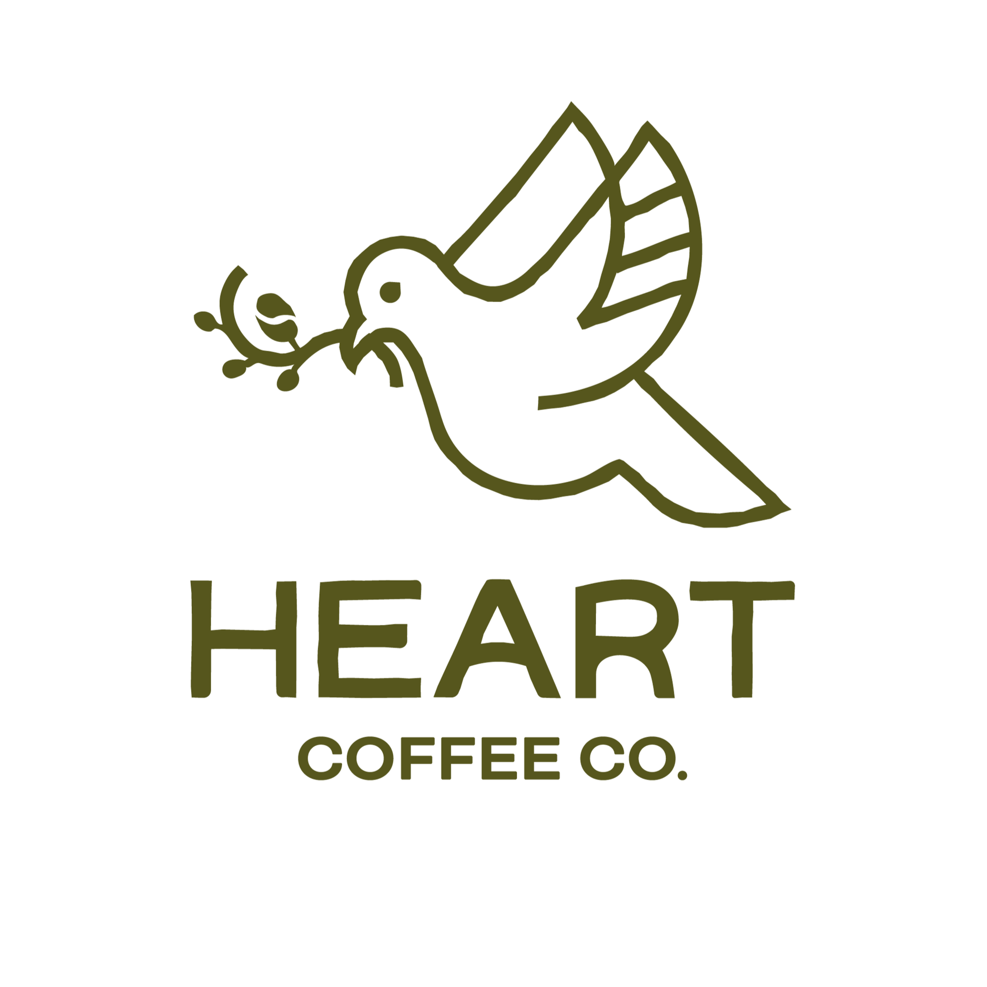
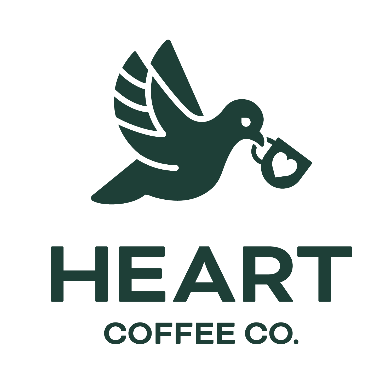
Pictured to the left is the final logo. While it can also be shown in color, it is most often shown in white with a colored background. This is preferred since the logo is a dove.
I chose to represent the brand with a logo of a dove since it is often portrayed as a symbol of love, joy, gentleness, and hope. To relate the type to the graphic, the dove is carrying a mug with a heart symbol on it. The mark has gentle curves and rounded corners to accompany the symbolism and brand personality.
Brand guidelines were created to show Heart’s values, background, and how to use the logo and branding properly.
Logo & Brand Guidelines

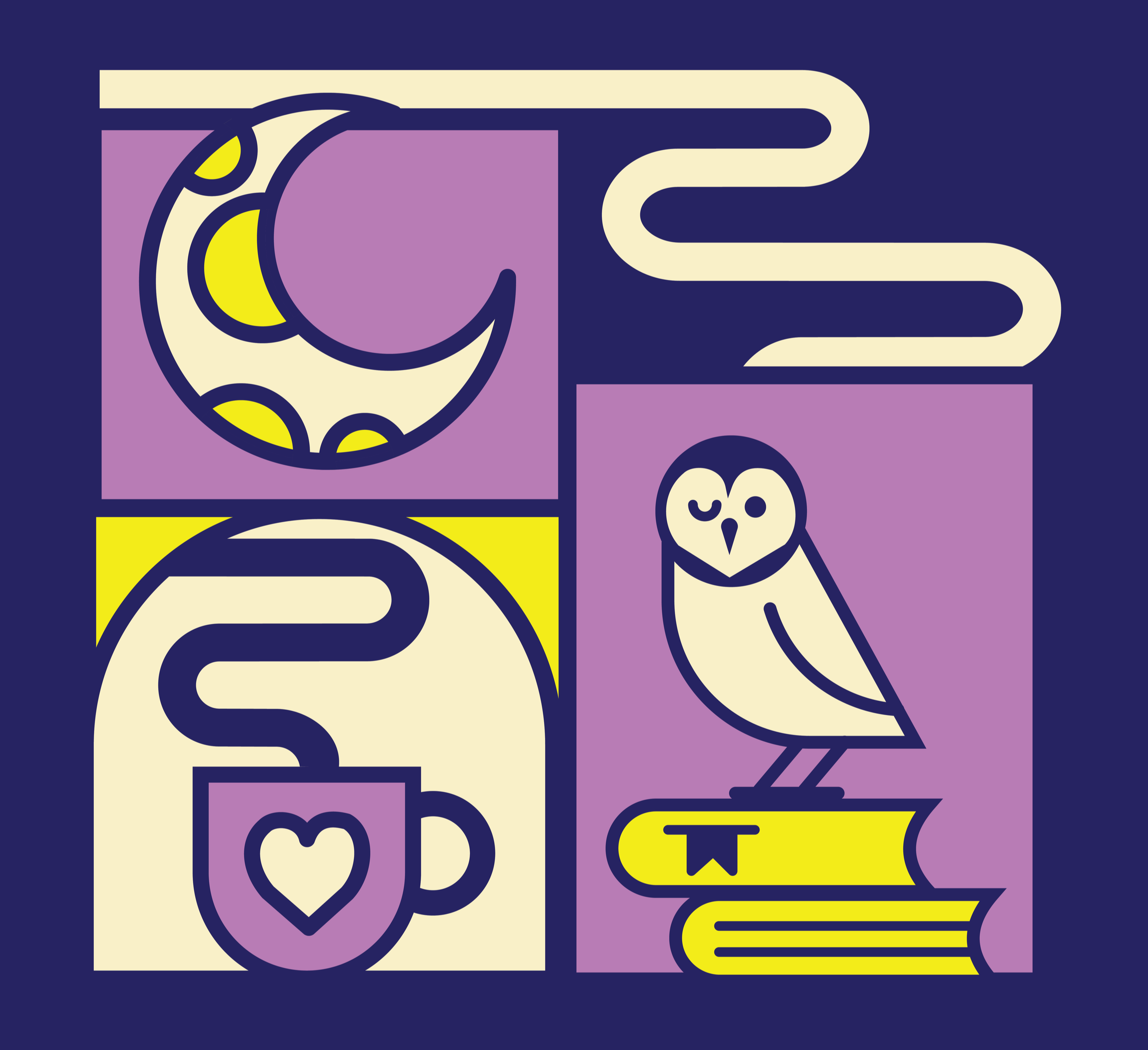
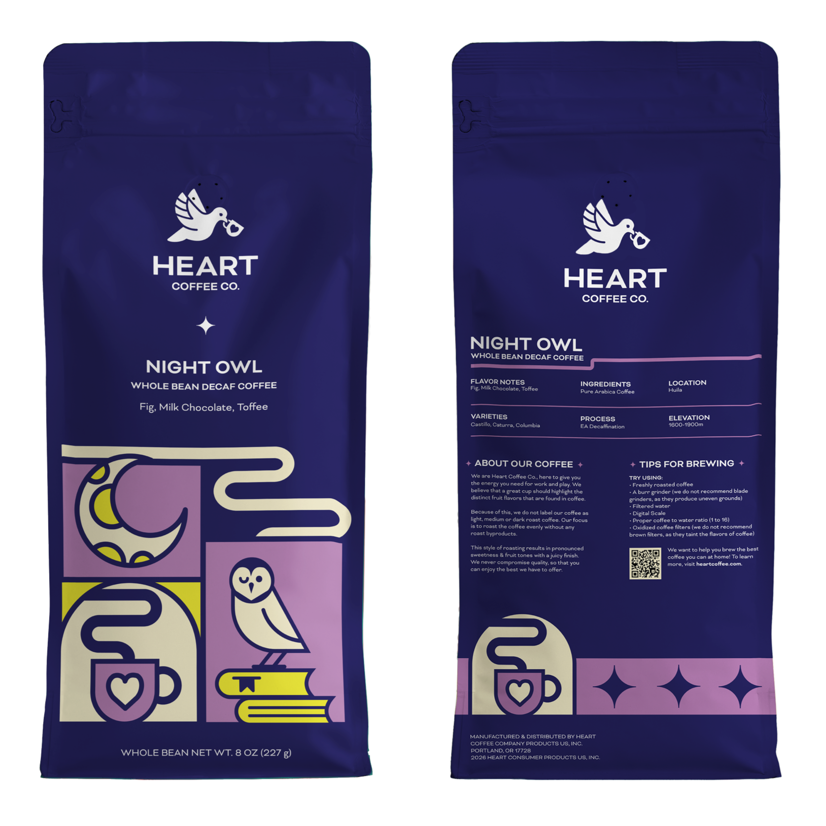
The packaging features geometric illustrations meant to represent hobbies, activities, interests, or just the act of being present. I used a thick, rounded stroke on my illustrations to communicate a soft and friendly persona. Balance and organization were highly considered throughout the development of each bag design. Since each one is organized into individual parts, much focus was also placed on using elements to break the space.
Packaging
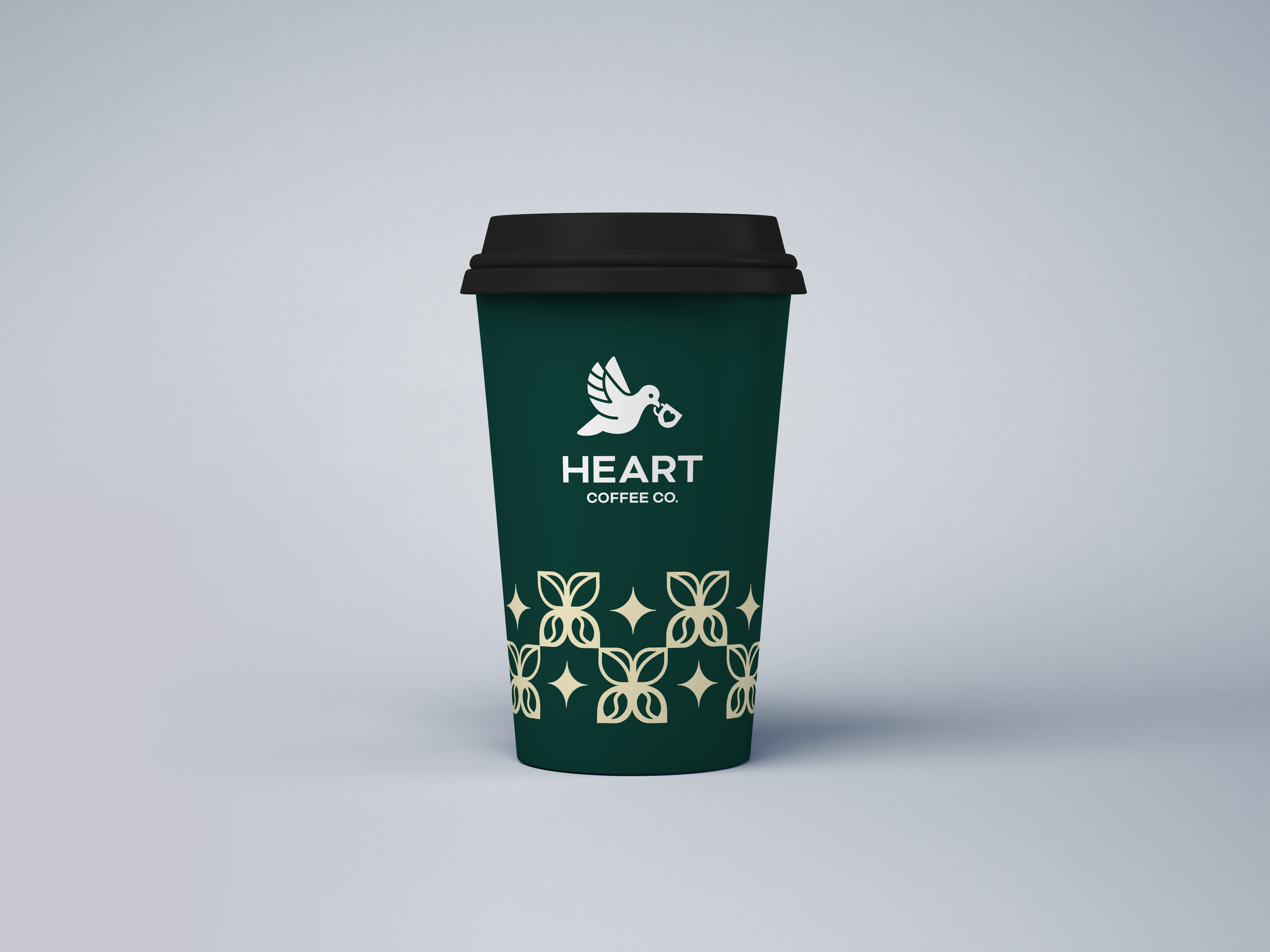
The to-go cup is a representation of repeated brand elements, those being the colors and pattern I created. Since the bags are each brightly colored with their own different illustration, I designed the cup to be elegant and branded.
To-Go Cup
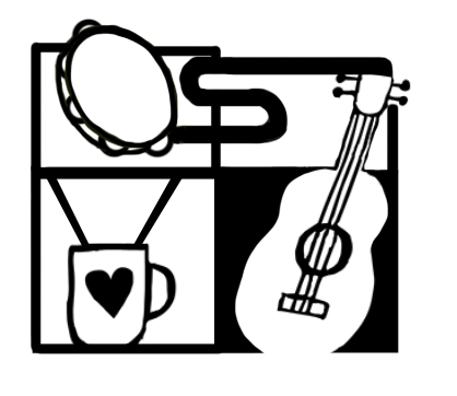
I created the wall design to accompany the packaging in terms of illustration style and theme. Similarly to the bags, I focused on creating balance and representing different hobbies and interests.
Wall Mural
This set of three Instagram advertisements utilizes a collage style for each to promote a different coffee bag. I created depth through the use of textures, patterns, and slight gradients. I took advantage of the platform Instagram to create advertisements that were fun and a bit different stylistically from the packaging and wall design, but still carried through the brand elements.
Advertisements
The microsite uses repeated brand elements to create an aesthetically pleasing user experience and communicate Heart’s elegance and high-end products and design. This prototype includes information about the brand and pages that lead the user through the purchasing process of one product.
Microsite